Forget first impressions, this powerful entry leaves a lasting impression! Entrants are instantly enveloped in a colorful sheath of exuberance. Deep dark and sexy surfaces are swathed in Sherwin Williams Sommelier foreshadowing the superior style, drama, and design to come. Accents are limited to brass, crystal and black including our bold choice to paint the stair risers in Sherwin Williams Tricorn Black. By curating the color palette down to the essentials, a greater impact is achieved.
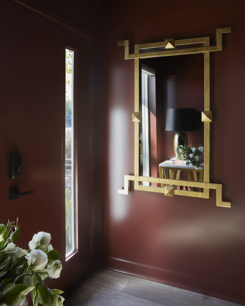
Photo Credit: Zeke Ruelas
To illuminate the way, we selected an Allegri light fixture by Kalco with a layered, linear design. Leading the eye aloft, this quickly but expertly (if I do say so myself) installed gallery wall charms guests as they climb. Gallery walls do not have to be frustratingly fussy and precise. This series of frames in black, brass, and natural wood are filled with a collection of images, inspirations, and fabrics that I love. Paying attention to finish and scale, simply work your way up the wall alternating colors and sizes.
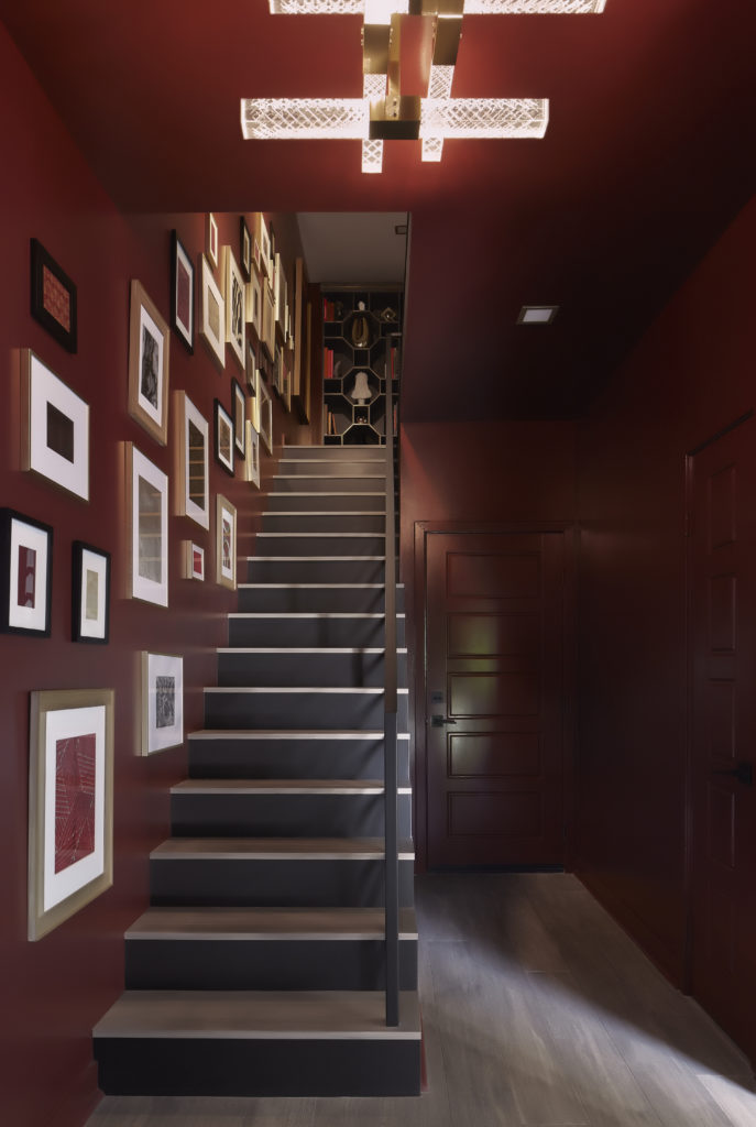
Photo Credit: Zeke Ruelas
All efforts will be rewarded when the second floor is reached. Sommelier gives way to Sherwin Williams Pewter Cast. What was once a series of doors has been simplified to a modern gallery with a goal. As the main living area of our home is on the third floor this area’s intention is transition. The gallery wall has pulled you to this level and an enticing pair of artwork eyes lures you forward. A simple ensemble of console table and ottoman by Houzz/Safavieh provides the perfect landing spot for a drink, or if exhausted, me.
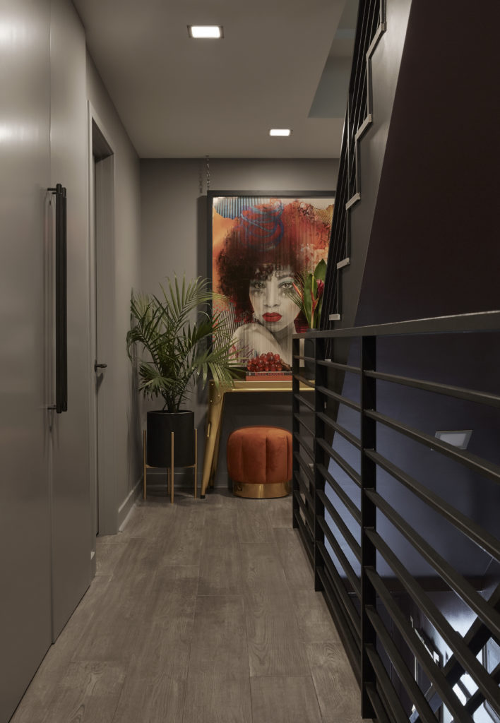
Photo Credit: Zeke Ruelas




add a comment
+ COMMENTS