


Paint color is everything when it comes to using interior design strategies in your home. As a member of the Sherwin-Williams Design Council, my team at John McClain Design and I have access to more paint mixes than you can imagine for use in designing homes.
It’s only natural that by now I would have a list of favorites, so it seems fitting to dedicate an entire blog post to my top 10 interior paint color choices and why.
My Top 10 Interior Paint Colors:

1. High Reflective White (SW 7757)
White paint finishes widen and elongate, which makes it the ideal color for ceilings and trimmings. Our go-to is High Reflective White because it provides a clean and fresh finish. As the name implies, this shade reflects the most amount of light into a room and goes well with many color palettes. Perfect for adding contrast!

2. Origami White (SW 7636)
Seating options are limitless when it comes to the outdoors. Outdoor furniture and materials are evolving more and more these days. Many companies are realizing that your outdoor space and indoor space are almost one and the same. To that end, outdoor upholstery looks just like indoor upholstery, including lush fabrics. Chairs, tables and even lighting are taking on the same aesthetics as indoor products. Expand your mind past the typical wicker or rattan; the options are endless now! As long as the product is outdoor rated, you are good to go. Bottom Line: Treat your outdoor space with the same care you would for laying out the furniture plan of your indoor spaces. The only limit is your mind.

3. Drift of Mist (SW 9166)
Work the room by incorporating natural elements. Add greenery for not only aesthetic appeal but also the added health benefits of improving air quality and mental well-being. You can even turn this step into a hobby by growing a garden. Not ready to garden out? Try an herb garden instead. For smaller spaces, greenery in vertical planters and hanging plants make gorgeous space-saving accents. If you’re going for a minimal look, opt toward incorporating stones that create a grounding effect while also increasing wellness.

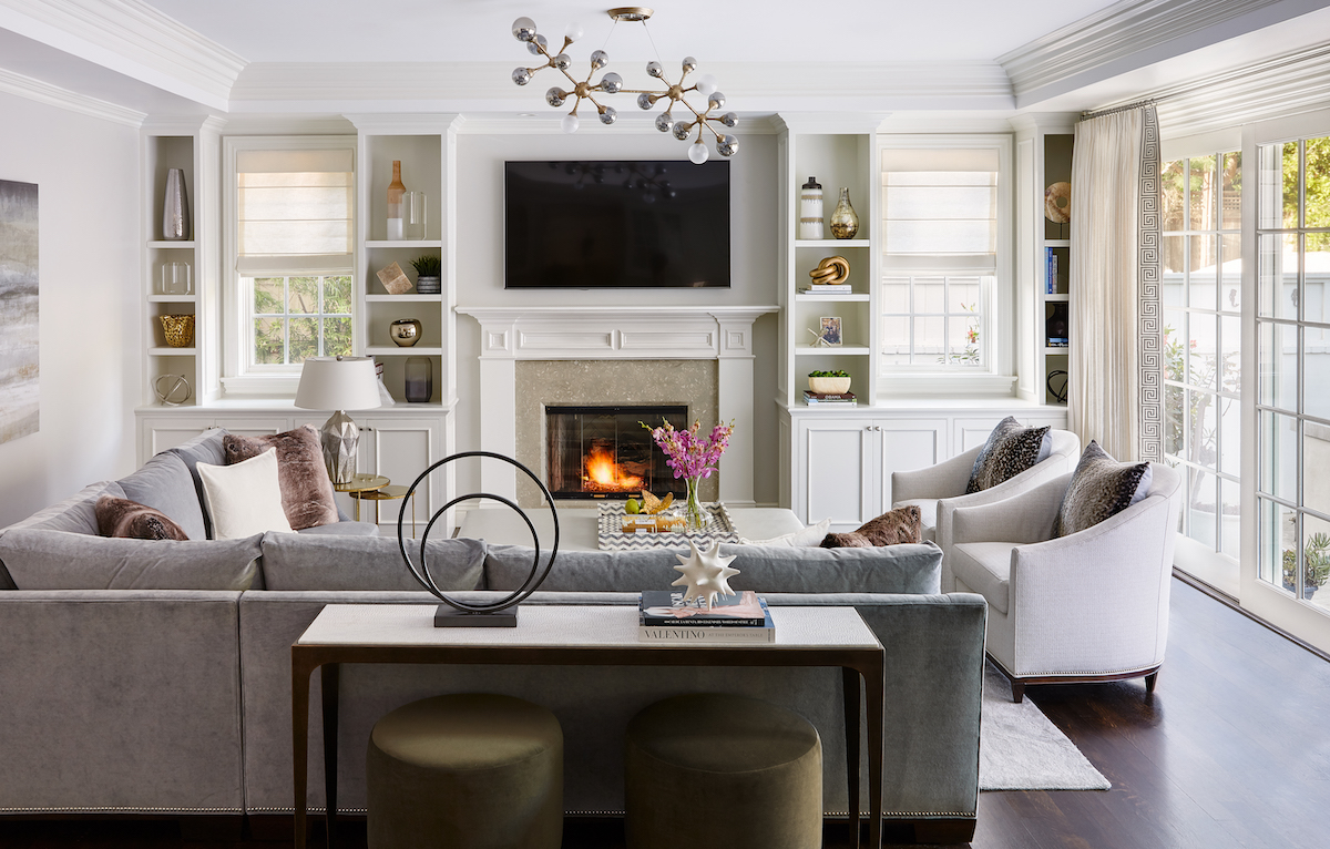
4. Agreeable Gray (SW 7029)
A truly agreeable greige (mix of gray and beige) that goes with any tone. This congenial color has a brown undertone giving it most of its warmth, while a touch of violet gives it a balancing coolness. As one of Sherwin-Williams’ most popular colors, this interior paint color has been showing up in color palettes all over.

5. Dorian Gray (SW 7017)
Timeless and never aging out of style, the Dorian shade of gray brings more boldness and depth to a room than other traditional grays. It can work well in interiors, as well as on exteriors of a home. As a warm paint color, it pairs well with light to medium beiges and warm greens.

6. IRON ORE (SW 7069)
Iron Ore is one of our more favorite dark and moody interior paint colors. A gray base with slight purple, brown and green undertones, it falls between dark gray and black. It is excellent for an office, or kitchen cabinet features!

7. Caviar (SW 6990)
Described in one word: glam! To create a bit of controversy we always lean toward this caviar shade. Be aware, it is an extremely dark color and therefore offers minimal light reflection. When using it in small spaces, opt to use it as an accent color.

8. Sea Serpent (SW 7615)
If we had to pick only one color to serve as an accent color in our repertoire it would be Sea Serpent. Think of how gorgeous this cool neutral blue with slightly gray undertones would look covering kitchen cabinets or paneled accent walls. Oooh la la!

9. Urbane Bronze (SW 7048)
A gray paint color with deep bronze undertones inspired by nature. Antique yet exuding a warm sexiness, Urbane Bronze is Sherwin-Williams 2021 color of the year. If you’re bold, don’t be afraid to cover bedroom walls with it or even the exterior of a home — just be sure to pair it with other warm tones!

10. Succulent (SW 9650)
The focus on all things natural rounds out my top 10 paint choices with the color Succulent. This soft dusty green adds an earthy and stabling presence to any room. It’s a vibe I’m sure we could all use a little bit more of in our homes.
More Paint Color Inspo
One thing to always remember about interior paint is that you should experiment with the paint swatches before you take the leap and commit to a color. How paint looks on paper and how it shows up on walls are two very different things.
Pro Tip: Paint a small color patch on the wall to see how the color appears during the daytime versus nighttime.
Interior Paint Resources
If you’re going the DIY home paint route, read our blog post on the 10 Paint Mistakes to Avoid before you get started. Also, be sure to check out all the other interior and exterior paint colors at sherwinwilliams.com for more paint inspiration.
Share with us a photo of your finished wall paint project by tagging @johnmcclaindesign on Instagram!
Till Next Time,
Happy Designs!


add a comment
+ COMMENTS